This is the story behind the Falling into the Five Senses cover. I will unashamedly say that I made this cover, and that I love it and I’m very proud of it.
When I very first had the idea for the #5Senses project, I knew I also wanted to do the cover for it. I have … let’s call them aspirations towards doing visual-arty things. And doing the cover sounded fun and absolutely in line with what a DIY collaborative writing project should be about. But, by the time the writing part of the project was being wrapped up, the shoestring budget made a DIY cover a necessity.
The prospect of doing the cover suddenly became a whole lot more daunting. Especially as I began researching DIY cover-makers and advice on eye-catching cover designs. The recurring advice was invariably ‘if you can afford it, do not DIY your cover. Get a professional cover designer’. I have seen some fabulously-wonky and amateurish designs. I knew what the dangers were – including the giant danger of me being an utter beginner at photoshop.
Here is my (long) timeline of steps towards the final cover:
I know I want to have a face on the cover. A face represents the 5Senses more obviously and more eloquently than anything else I can think of. So, a face – and a hand for touch, obviously – are core elements of the design. I visualise a photo collage assembled from different people’s features. Although… there are potentially-messy copyright issues tied up in using other people’s images. Aren’t there? I assume ‘yes’ and sensibly stay well away from that minefield.
Ooooh, it occurs to me that maybe I could use the 5Senses’ collaborators’ faces? But most of the 5Senses collaborators are a bit shy – or very sensible – about sending in photos of themselves to be butchered by a photoshop amateur.
Hmmm, I think to myself (because my visual-arty interests extend to drawing), maybe I should try drawing a face that I then turn into a jagged-edge, photo collagey effect. I have a go… The result?
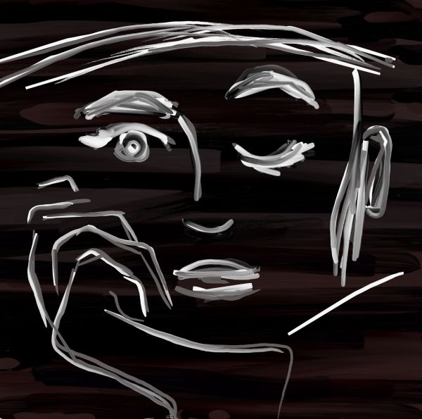
Yeah, no, try again. Really, really try again. (Actually, the main thing I like about this is how I drew the hand. The hand is pretty good.)
I turn to a lovely cousin of mine, who works in the digital art and photography space. She very generously agrees to help. She does a photoshoot with a friend of hers, Francesca Verga, and then begins composing the cover in photoshop using my vague, not-yet-thought-out guidelines as her only guide. When it becomes clear that I don’t quite know what I want or how I want it to look, she is not the least bit annoyed and gently says she can’t afford to put more time aside on the project and instead offers to send me all the raw photoshop files, including the individual .psd layers, and all the raw photos from the photoshoot just in case I can use them. No, she laughs, she doesn’t want any credit. I abide grudgingly by her no-credit wishes, but I give her all the credit in the world in my Acknowledgements at the end of the book.
So now I have a huge collection of raw photos. And although I still can’t photoshop, I can use PaintShopPro (PSP) without ripping my hair out of my scalp. Now, excrutiatingly slowly, I start to make progress. I find a couple of images that I run filters and effects over until the photos finally, vaguely, begin to resemble the vague idea I have in mind’s eye.
How to compile and layer them? There are ways to do this in PSP, but I’m not an expert. I have no idea if I’m even working with a doc that’s close to the correct size/resolution. I’m playing it safe and using a very large doc, so that the resolution will be high when compressed, but still. I know there are things called cover creators.
Again, more online research. Buy this program, download that, pirouette eleventeen times at dawn while only facing the north, and other awkward options are on offer. Gah. Then I return to canva.com. Apologies for sounding like an ad, but it is a very easy platform to use. Free to sign up, get started, user-friendly and instant results. I start with some of their free book cover templates, just playing with ideas, fonts and colours. The layering bit, which is such a headache in PSP is easy in Canva. I use their templates, footle around with fonts, and play with the positioning of images and backgrounds.
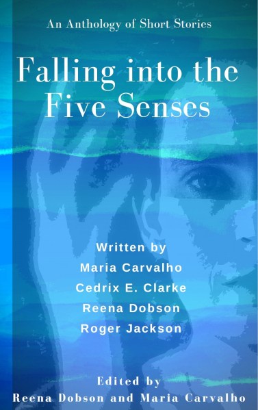
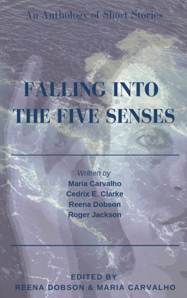
On my second attempt, I get my first prototype of the lady’s-half-face-plus-hand-superimposed-on-water cover. I knock it out in 15 minutes one morning before my Little One has woken up and before I have to get ready for work. My first thought is: ‘it looks professional!‘ It honestly looks like something you might see on a bookshop shelf. This is my first moment of confirmation in the whole cover-attempt process. This hasn’t been a completely nutty idea. I do have an idea and I’m starting to get there and the cover will look professional(-ish).
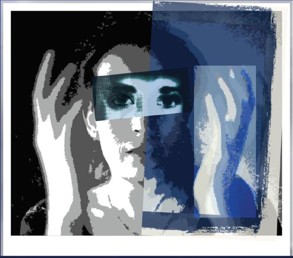
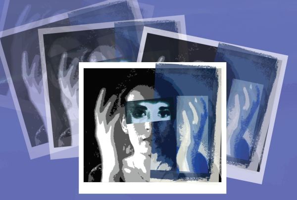
Then, I over-think the female-half-face-plus-hand on the whole cover approach on the basis it seems like a popular idea that is already well-used. I play around with a polaroid idea. I use Canva to add a couple of extra interesting layers to the face in the polaroid. Then I try arranging several polaroids of varying degrees of transparency into a ‘Falling’ pattern. At this point, I’m hopping between PaintShopPro and Canva and am hoping I’m saving all the different layers and steps separately as I go – it’s a bit hard to keep track.
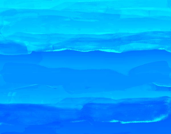
Then, I over-think using the stock Canva water background of the prototype cover. I don’t own the image of the water. What are the copyright and ownership issues in using a Canva-provided piece of art, especially for use in a piece of work which is commercial/ for-profit? The internet hums and haws and is doubtful. I decide not to risk it. I have my own water and ocean photos, taken with my good camera (i.e., not my camera phone). I decide I will scour through these photos. But… it transpires in a fit of organisational neatness, I removed the photos from my camera’s memory and put them all on my external hard drive. The same external hard drive that has been so carefully packed away since we moved, that I don’t actually know where it is (aaaaarrrgh)!
I set my jaw metaphorically. Very well then. I will make my background. Create one. From scratch. Again, hello, PaintShopPro, my old friend. I try various paintbrush settings. I find one that seems to work. I use the midnight blue colours I’m regularly drawn to. I come up with a slow graduation of midnight blue. I step back to look at the overall effect. There are suggestions of misty canyons near dusk blended in with night skies. Or they could be ideas of ocean songs at night. A few tiny – and lucky – lines of moonlight blue look as though I put them there on purpose.

I layer my face images against this background. Yes, this could work… But the background is a bit too… subdued.
I play with the hue settings. I can’t remember what combination of hue settings I use, but after several attempts (at least twelve attempts, going by various shades I saved), the midnight blue shades transform into the most beautiful, most perfect lagoon-esque shades of aqua, blue and teal. Cue the chorus of angel songs. Save it! Save it! Save it! It doesn’t seem to be a hugely popular colour in the vast stable of book cover colours. And it’s a perfect lagoon and ocean colours to complement the ‘Falling’ title! Plus, you know, I’m an island girl who grew up with lagoons. Background achieved!
Next, I paralyse myself trying to decide which face design option to go with. I’m drawn more towards the larger, half-face-with-hand. But the falling polaroid is more full, it’s more clearly suggestive of the 5Senses and the ‘Falling’. And I’ve spent a lot of time trying to get the falling polaroids to fall just right.
Maria Carvalho, co-collaborator, co-contributor, co-editor, and the primary reason the anthology got finished, does an informal market survey amongst her network. She even switches the images around mid-survey to account for ‘first image bias’ (oh yes, dear reader, I learnt a big lesson there too!). The end result is too close to call. They are both well-received. I follow suit in my network, and again, the feedback is too close to call.
I end my prevaricating and go with the polaroid cover.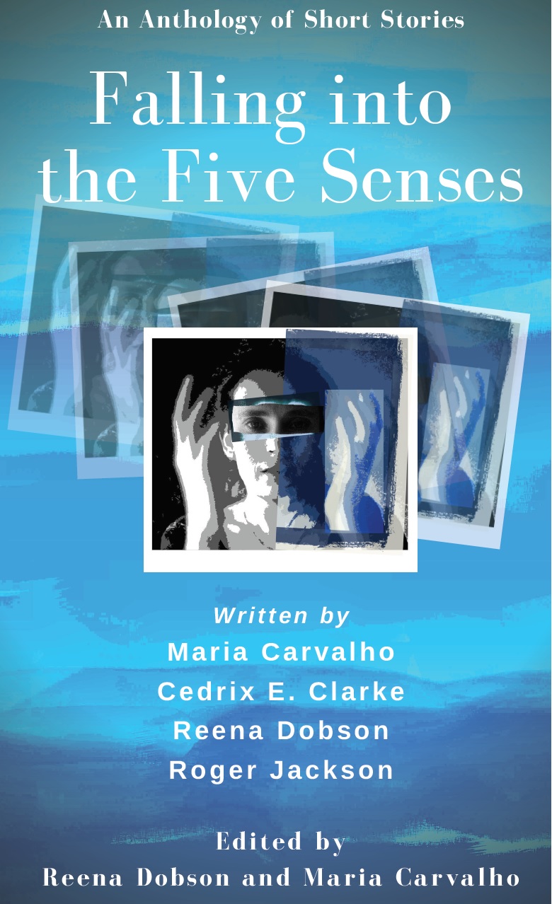
My head says firmly it’s the best one. Decision done.
Some two weeks before the ebook goes live, I change my mind and I go with my heart. As you do. Decision again. This time, the correct one.
And this is the full, long story behind my antho book cover!
Oh. Obligatory plug on where you can buy the book – you know, if the cover actually makes you curious about the stories inside 😉
Ree x

Leave a comment